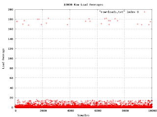
Arthur Gleckler suggested that I put up some graphs to illustrate the data analysis I was talking about earlier. I've decided to give it a try. Here are the raw load averages collected from a whole bunch of machines.

What do you know? It worked!
This is the first graph I made from the data I've collected. I wasn't really expecting much, but there are a few things to notice: first, there is a really unhappy machine with a load average in the 170 range. Second, my scanning program does not poll at regular intervals.
The unhappy machine turned out to be missing an important library. Unfortunately, the software reacted to this problem by spawning a process that itself depended on the library. When I checked, the machine had several thousand failing processes.
Other than those two facts, the graph isn't very informative. Everything is squeezed down into the bottom. But watch what happens when I convert the load average to decibels.

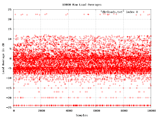
Now things start to get interesting. In the middle of the graph are two bands of higher density. This indicates a bimodal distribution of loads. It would be good to find out what causes that. Another thing to notice is that if we ignore the misconfigured machine, the graph has a fairly sharp upper edge at about 13dB. We can say that if the machine load ever gets above 13dB, it is
clearly in trouble.
At the bottom of the graph the load averages fall into discrete lines. This is an artifact of the way loads are reported. They are rounded to the nearest hundredth, and when we show them in log scale, the rounding becomes obvious at the bottom of the graph.
(more soon...)
 What do you know? It worked!
This is the first graph I made from the data I've collected. I wasn't really expecting much, but there are a few things to notice: first, there is a really unhappy machine with a load average in the 170 range. Second, my scanning program does not poll at regular intervals.
The unhappy machine turned out to be missing an important library. Unfortunately, the software reacted to this problem by spawning a process that itself depended on the library. When I checked, the machine had several thousand failing processes.
Other than those two facts, the graph isn't very informative. Everything is squeezed down into the bottom. But watch what happens when I convert the load average to decibels.
 Now things start to get interesting. In the middle of the graph are two bands of higher density. This indicates a bimodal distribution of loads. It would be good to find out what causes that. Another thing to notice is that if we ignore the misconfigured machine, the graph has a fairly sharp upper edge at about 13dB. We can say that if the machine load ever gets above 13dB, it is clearly in trouble.
At the bottom of the graph the load averages fall into discrete lines. This is an artifact of the way loads are reported. They are rounded to the nearest hundredth, and when we show them in log scale, the rounding becomes obvious at the bottom of the graph.
(more soon...)
No comments:
Post a Comment