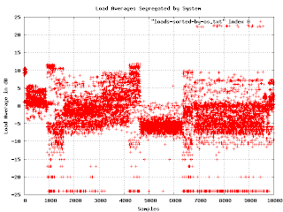
Although the graph of loads in decibels has some interesting features, I couldn't figure out how to correlate the bands in the graph to some meaningful fact about the machines. I tried plotting the load average against other quantities I had measured, but there was no obvious reason for what I was seeing. In desperation, I tried a few off-the-wall ideas. One was to sort the samples lexicographically by operating system version. This is the resulting graph:
 Now
Now I was getting somewhere. It seems that the load averages are strongly affected by the underlying operating system. On one level, this isn't surprising, but since the various OS are supposed to be very similar, I expected much less variation. Apparently OS selection is much more important than I thought.
I found a problem with this graph. When I showed it to people, they wanted to know what the X axis is (it isn't much of anything in this graph except that each data point has a different value for X). Lexicographical ordering of the OS isn't really related to the linear axis other than for grouping purposes. The important feature is that different OSs have different bands of density in the sample space. What I really needed was to separate the graphs and plot the density as a histogram. This turns out to be a lot easier said than done.

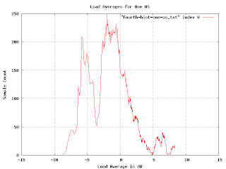
Here are the load averages for one particular OS (the one that occupies the range from 7000 to 9500 in the earlier graph). You can just make out two density bands. What we want is a simple histogram of the density as it changes when we go from the bottom to the top of the graph. No problem:
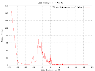
But something is wrong here. There are some bumps in the graph where you would expect, but the sizes are wrong. The peak for the loads at -5dB is
much bigger than the one at 0dB, but the density of points at -5db doesn't seem much higher than that at 0dB. And shouldn't there be a blip up at 23dB?
Since we are using the logarithm of the load average, the buckets for the histogram are non uniform (in fact, they are exponentially decreasing in size). We can fix this by multiplying by a normalization factor that increases exponentially.
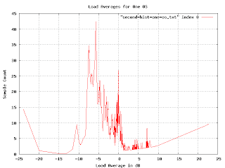
This is more realistic, but the exponential multiplication gives some weird artifacts as we approach the right-hand side. Since we know that load averages won't normally exceed 13dB, we really want to just look at the middle of the graph.
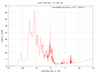
The problem we are encountering here is that graph is far too jagged as we approach the right-hand side. This is because the buckets are getting very fine-grained as the load gets higher. We want to smooth the histogram, but we want the smoothing to encompass more and more buckets as we reach the higher loads. I spent a couple of days trying to figure out how to convolve this graph with a continuously varying gaussian curve. I actually got somewhere with that, but it was really hard and very slow (you have to do a lot of numeric integration).
Raph Levien suggest punting on this approach and just plotting the accumulated loads. I tried this, but for this particular problem it doesn't give the information I wanted. (I mention this because the idea turns out to be applicable elsewhere.)
Over the weekend I had an insight that in retrospect seems obvious. I guess I was so stuck in the approach I was working on that I didn't see it. (The seductive thing about my approach is that I
was making progress, it just was getting to the point of diminishing returns). The buckets are hard to deal with because they vary in size. They vary in size because I took the logarithm of the load. If I simply perform the accumulation and smoothing
before taking the logarithm all the problems go away. (Well, most of them, I still need to vary the smoothing, but now I can vary it linearly rather than exponentially and I can use addition rather than convolution). Here is what the graph looks like when you do it right:
In order to check if I was doing it right, I generated some fake data with varying features (uniform distributions, drop-outs, gaussians, etc.) and made sure the resulting histogram was what I expected. I'm pretty confident that this histogram is a reasonably accurate plot of the distribution of load averages for the system in question.
(more later...)
 Now I was getting somewhere. It seems that the load averages are strongly affected by the underlying operating system. On one level, this isn't surprising, but since the various OS are supposed to be very similar, I expected much less variation. Apparently OS selection is much more important than I thought.
I found a problem with this graph. When I showed it to people, they wanted to know what the X axis is (it isn't much of anything in this graph except that each data point has a different value for X). Lexicographical ordering of the OS isn't really related to the linear axis other than for grouping purposes. The important feature is that different OSs have different bands of density in the sample space. What I really needed was to separate the graphs and plot the density as a histogram. This turns out to be a lot easier said than done.
Now I was getting somewhere. It seems that the load averages are strongly affected by the underlying operating system. On one level, this isn't surprising, but since the various OS are supposed to be very similar, I expected much less variation. Apparently OS selection is much more important than I thought.
I found a problem with this graph. When I showed it to people, they wanted to know what the X axis is (it isn't much of anything in this graph except that each data point has a different value for X). Lexicographical ordering of the OS isn't really related to the linear axis other than for grouping purposes. The important feature is that different OSs have different bands of density in the sample space. What I really needed was to separate the graphs and plot the density as a histogram. This turns out to be a lot easier said than done.
 Here are the load averages for one particular OS (the one that occupies the range from 7000 to 9500 in the earlier graph). You can just make out two density bands. What we want is a simple histogram of the density as it changes when we go from the bottom to the top of the graph. No problem:
 But something is wrong here. There are some bumps in the graph where you would expect, but the sizes are wrong. The peak for the loads at -5dB is much bigger than the one at 0dB, but the density of points at -5db doesn't seem much higher than that at 0dB. And shouldn't there be a blip up at 23dB?
Since we are using the logarithm of the load average, the buckets for the histogram are non uniform (in fact, they are exponentially decreasing in size). We can fix this by multiplying by a normalization factor that increases exponentially.
But something is wrong here. There are some bumps in the graph where you would expect, but the sizes are wrong. The peak for the loads at -5dB is much bigger than the one at 0dB, but the density of points at -5db doesn't seem much higher than that at 0dB. And shouldn't there be a blip up at 23dB?
Since we are using the logarithm of the load average, the buckets for the histogram are non uniform (in fact, they are exponentially decreasing in size). We can fix this by multiplying by a normalization factor that increases exponentially.
 This is more realistic, but the exponential multiplication gives some weird artifacts as we approach the right-hand side. Since we know that load averages won't normally exceed 13dB, we really want to just look at the middle of the graph.
 The problem we are encountering here is that graph is far too jagged as we approach the right-hand side. This is because the buckets are getting very fine-grained as the load gets higher. We want to smooth the histogram, but we want the smoothing to encompass more and more buckets as we reach the higher loads. I spent a couple of days trying to figure out how to convolve this graph with a continuously varying gaussian curve. I actually got somewhere with that, but it was really hard and very slow (you have to do a lot of numeric integration). Raph Levien suggest punting on this approach and just plotting the accumulated loads. I tried this, but for this particular problem it doesn't give the information I wanted. (I mention this because the idea turns out to be applicable elsewhere.)
Over the weekend I had an insight that in retrospect seems obvious. I guess I was so stuck in the approach I was working on that I didn't see it. (The seductive thing about my approach is that I was making progress, it just was getting to the point of diminishing returns). The buckets are hard to deal with because they vary in size. They vary in size because I took the logarithm of the load. If I simply perform the accumulation and smoothing before taking the logarithm all the problems go away. (Well, most of them, I still need to vary the smoothing, but now I can vary it linearly rather than exponentially and I can use addition rather than convolution). Here is what the graph looks like when you do it right:
The problem we are encountering here is that graph is far too jagged as we approach the right-hand side. This is because the buckets are getting very fine-grained as the load gets higher. We want to smooth the histogram, but we want the smoothing to encompass more and more buckets as we reach the higher loads. I spent a couple of days trying to figure out how to convolve this graph with a continuously varying gaussian curve. I actually got somewhere with that, but it was really hard and very slow (you have to do a lot of numeric integration). Raph Levien suggest punting on this approach and just plotting the accumulated loads. I tried this, but for this particular problem it doesn't give the information I wanted. (I mention this because the idea turns out to be applicable elsewhere.)
Over the weekend I had an insight that in retrospect seems obvious. I guess I was so stuck in the approach I was working on that I didn't see it. (The seductive thing about my approach is that I was making progress, it just was getting to the point of diminishing returns). The buckets are hard to deal with because they vary in size. They vary in size because I took the logarithm of the load. If I simply perform the accumulation and smoothing before taking the logarithm all the problems go away. (Well, most of them, I still need to vary the smoothing, but now I can vary it linearly rather than exponentially and I can use addition rather than convolution). Here is what the graph looks like when you do it right:
 In order to check if I was doing it right, I generated some fake data with varying features (uniform distributions, drop-outs, gaussians, etc.) and made sure the resulting histogram was what I expected. I'm pretty confident that this histogram is a reasonably accurate plot of the distribution of load averages for the system in question.
(more later...)
In order to check if I was doing it right, I generated some fake data with varying features (uniform distributions, drop-outs, gaussians, etc.) and made sure the resulting histogram was what I expected. I'm pretty confident that this histogram is a reasonably accurate plot of the distribution of load averages for the system in question.
(more later...)
1 comment:
Nice. Sorting the data alphabetically by the OS name is not something I would have thought of. I wonder if how well the load average really compares across different kernel versions, especially with the different scheduler changes they've been making.
Post a Comment