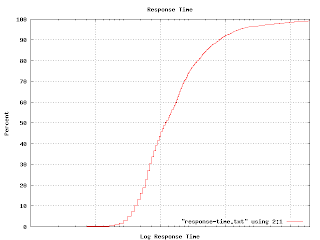
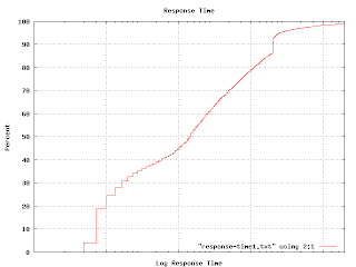
 I mentioned in an earlier post that I tried using a cumulative probability graph without much success. It turns out that this sort of graph comes in handy for answering particular kinds of questions. For example, I wanted to illustrate the various response times of one class of machines, so I generated this graph. (The actual graph has numbers along the X axis. Imagine that the tic marks represent `centons' in the middle, `microns' to the left and `arns' to the right.)
The percent axis tells you what percent of response times are faster than the graphed point. That is, to find the median response time, go to the 50% mark and read across and then down. You'll find that the median is a tad over 1 centon. Half of the responses happen faster, half take longer. The 92 percentile is at 1 'arn'. It is pretty unlikely you'd have to wait this long for an answer, but not impossible. Very few responses seem to come in at a `micron'. It turns out that many measurable properties have these S-shaped curves. That isn't surprising because this curve is simply the integral of the underlying distribution (which is often Gaussian). But plotting like this avoids the bucketing issues I was having earlier. If you plot a graph like this and find kinks and non-linearities in it, you have discovered some outliers. This graph shows one.

That hook-shaped kink in the upper right is caused by a particular bug which prevented some of the machines from responding until a certain timeout had expired. The timeout value is excessively long and this graph makes that obvious.
Empirically, my observed samples have a log-normal distribution. This is quite interesting because log-normal distributions behave quite differently from Gaussian distributions. For example, the average value falls quite far from the median. The log-normal distribution is also highly asymmetric. You need to use the geometric mean and geometric standard deviation rather than the more common arithmetic mean and standard deviation.
No comments:
Post a Comment