Robert W. Baldwin
1957 - 2007
Wednesday, August 22, 2007


Saturday, August 18, 2007
How I do love blogging
So I tried changing the blog settings to not convert line breaks and now all the paragraphs run together. I tried putting in extra blank lines between paragraphs and they disappear, but the first paragraph has extra large spacing between the lines.
All these posts look fantastic in the preview mode, but as soon as I hit publish, the web gremlins of ugliness sprinkle their magic style directives on my text.
Another Couple of Graphs
 I mentioned in an earlier post that I tried using a cumulative probability graph without much success. It turns out that this sort of graph comes in handy for answering particular kinds of questions. For example, I wanted to illustrate the various response times of one class of machines, so I generated this graph. (The actual graph has numbers along the X axis. Imagine that the tic marks represent `centons' in the middle, `microns' to the left and `arns' to the right.)
The percent axis tells you what percent of response times are faster than the graphed point. That is, to find the median response time, go to the 50% mark and read across and then down. You'll find that the median is a tad over 1 centon. Half of the responses happen faster, half take longer. The 92 percentile is at 1 'arn'. It is pretty unlikely you'd have to wait this long for an answer, but not impossible. Very few responses seem to come in at a `micron'. It turns out that many measurable properties have these S-shaped curves. That isn't surprising because this curve is simply the integral of the underlying distribution (which is often Gaussian). But plotting like this avoids the bucketing issues I was having earlier. If you plot a graph like this and find kinks and non-linearities in it, you have discovered some outliers. This graph shows one.

That hook-shaped kink in the upper right is caused by a particular bug which prevented some of the machines from responding until a certain timeout had expired. The timeout value is excessively long and this graph makes that obvious.
Empirically, my observed samples have a log-normal distribution. This is quite interesting because log-normal distributions behave quite differently from Gaussian distributions. For example, the average value falls quite far from the median. The log-normal distribution is also highly asymmetric. You need to use the geometric mean and geometric standard deviation rather than the more common arithmetic mean and standard deviation.
Thursday, August 9, 2007
What's missing from this picture?
A friend was conducting an interview the other day and asked the applicant to write a program that traversed a tree in depth-first order. The applicant started by defining a class for the nodes in the tree:
class Node {
    int value;
    Node parent;
}
Well, it is certainly space efficient. Optimized for going up the tree, too.
Tuesday, August 7, 2007
Naive Bayesian Classifier
In analyzing my data I wanted to classify it with a naive Bayesian classifier. I wasn't sure I had the math right, so I wrote a tiny abstract classifier to test with. The code is pretty cool:
(define (10log10 x)
  (* 10.0 (/ (log x) (log 10.0))))
;
(define (sum f list)
  (fold-left (lambda (sum element)
               (+ sum (f element)))
             0
             list))
;
(define (count-if predicate list)
  (sum (lambda (element)
         (if (predicate element)
             1
             0))
       list))
;
(define (count-if-not predicate list)
  (sum (lambda (element)
         (if (predicate element)
             0
             1))
       list))
;
(define (weight-if-present has-feature? positive-examples
                                        negative-examples)
  (10log10
   (/ (* (+ (count-if has-feature? positive-examples) .5)
         (length negative-examples))
      (* (+ (count-if has-feature? negative-examples) .5)
         (length positive-examples)))))
;
(define (weight-if-absent has-feature? positive-examples
                                       negative-examples)
  (10log10
   (/ (* (+ (count-if-not has-feature? positive-examples) .5)
         (length negative-examples))
      (* (+ (count-if-not has-feature? negative-examples) .5)
         (length positive-examples)))))
;
(define (weight has-feature?
                positive-examples negative-examples
                test-element)
  (if (has-feature? test-element)
      (weight-if-present has-feature? positive-examples
                                      negative-examples)
      (weight-if-absent  has-feature? positive-examples
                                      negative-examples)))
;
(define (naive-bayesian-classifier feature-list positive-examples
                                                negative-examples)
  (lambda (test-element)
    (sum (lambda (feature)
           (weight feature
                   positive-examples negative-examples
                   test-element))
         feature-list)))
.
Obviously this can radically improved for performance. Also note that your version of Scheme might take the arguments to fold-left in a different order. In Statistics and the War on Spam, Dave Madigan gives a really good introduction to naive Bayesian classifiers. The implementation above is based on that paper. The paper also describes why you add .5 to all the counts. To take the example directly from the paper:
;;; Message sets with stop words removed
;;; and word stemming applied.
(define *ham-messages*
  '((brown fox quick)
    (rabbit run run run)))
;
(define *spam-messages*
  '((quick rabbit run run)
    (rabbit rest)))
;
;;; A list of six procedures, each tests for
;;; the presence of a single word in a message.
(define *features*
  (map (lambda (word)
         (lambda (message)
           (member word message)))
       '(brown fox quick rabbit rest run)))
;
(define *example-classifier*
  (naive-bayesian-classifier
   *features*
   *ham-messages*
   *spam-messages*))
;
;;; Classify a new message.
(*example-classifier* '(quick rabbit rest))
;Value: -11.426675035687316
.
The value returned differs from the one in the paper for two reasons. I use positive values to indicate `ham' and negative for `spam', rather than vice-versa. I also compute the logarithm in base 10 rather than the natural log and multiply the result by 10 (decibels rule!). This makes it much easier to eyeball the results. Negative is bad, and every 10 dB is another order of magnitude. With a value of -11, I can see that this is spam with a better than 90% probability. (10 dB = 90%, 20 dB = 99%, 30 dB = 99.9%, 40 dB = 99.99%, etc.) Stupid blogger removes blank lines in PRE sections, so I inserted semicolons. It also has problems transitioning back out of PRE, so I have periods in there as well. I don't like to blog anyway, and this just adds another reason to avoid it.Wednesday, July 25, 2007
From Histograms to Scatter Plots
The histograms I generated helped people understand what the sample plots were showing, but they didn't really help me understand what was ultimately going on. For instance, it is clear that some of the histograms were bimodal or multimodal, but it wasn't clear what caused the different modes. I poked around at some of the data to see what caused some of the weirdness, and I found that some of the identifiable items were caused by misbehaving or misconfigured machines, or by machines that were being used for experiments. I didn't want to do this by hand, though, because it was rather time-intensive. I wanted to write a program that could automatically determine if a machine wasn't working correctly. It was clear that the machine with the load of 180 wasn't working right, but some of the other problem machines had much more subtle issues.
I tried creating some scatter plots of things that ought to be roughly correlated, but I was disappointed to see that nothing obvious stood out. Since I was using a computer, though, I decided to simply create scatter plots of every variable against every other variable. This gave me a couple hundred plots. Most of them were uninteresting. If two variables are exactly correlated, the plot is simply a line. If they are completely uncorrelated, the plot is a blob. But if the variables are loosely correlated, or if the correlation depends upon the correct functioning of the machine, you end up with a scatter plot with unusual and distinctive features. One of these caught my eye:
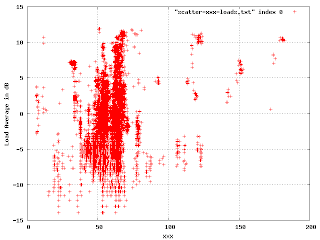 In this, we're plotting the load average (in dB) against a shared resource. The points outside the big blob are of interest. Where there is a cluster of points, like at (40, 7), I found that it was a single machine that was misconfigured in some particular way. The correctly working machines produced this part of the plot:
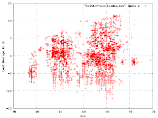 There is an obvious multi-modal distribution here that would have been difficult to see by plotting just one or the other variable.
 In this, we're plotting the load average (in dB) against a shared resource. The points outside the big blob are of interest. Where there is a cluster of points, like at (40, 7), I found that it was a single machine that was misconfigured in some particular way. The correctly working machines produced this part of the plot:
 There is an obvious multi-modal distribution here that would have been difficult to see by plotting just one or the other variable.
Where's the Lisp?
The first few graphs I made just by futzing around with Emacs and gnuplot. When I had to more processing by smoothing histograms and such I decided to use Scheme to manipulate the data. When I started thinking I had to convolve the data with gaussians I decided that I should use MIT Scheme because it has a pretty good compiler.
The script that probes the machines was written in Scsh, and I made sure to emit the samples in a trivially readable format.
Scheme has been great for experimenting with this. I've written a fair amount of ad-hoc code for generating the data for gnuplot, and most of the resulting graphs are uninformative. When I find some presentation that does show something of interest, I just replace the specific literals with variables and wrap a lambda around it.
I only mention this because I was surprised at how easy it was to transition from a small collection of random fragments of code to a simple toolkit by mixing and matching higher-order abstractions and by noticing common patterns. It is completely undisciplined programming, but very powerful.
Subscribe to:
Posts (Atom)